Light blue
#DEE4EB
For this portfolio project, I redesigned the e-commerce website of a popular chocolate brand in Argentina (Felfort). At a glance...
View live deployment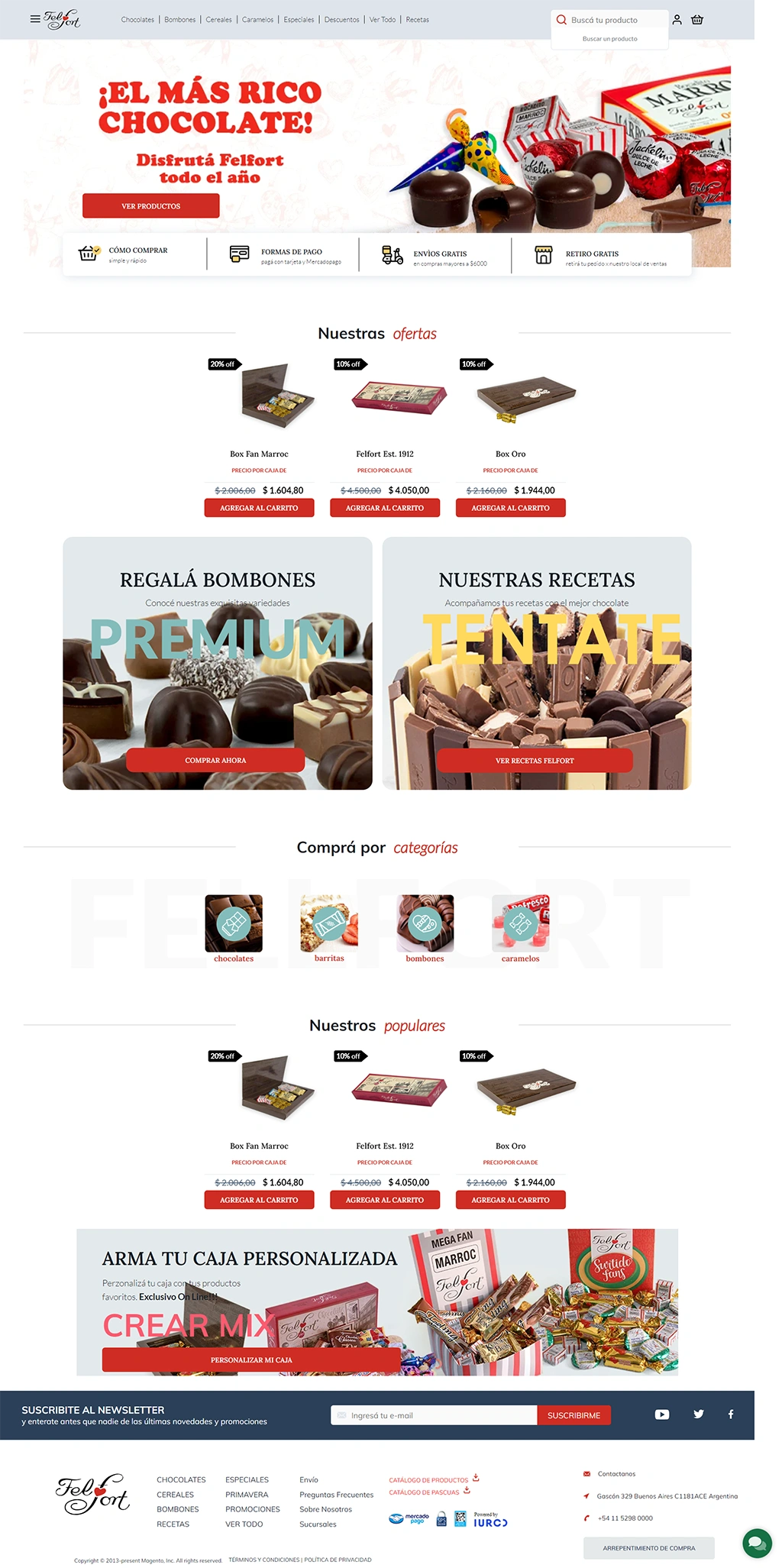

Blue, red, and green (as seen in the original website) seemed like a bit much. Initially, I considered keeping the red buttons for CTA’s, but I also wanted to use chocolate-like colors (different shades of brown and orange). So in the end, I decided to keep the chocolate-like shades and get rid of the red as well (even for CTA’s) to favor coherence and consistency.
Lato and Roboto for the default text are not so different, since they’re both standard sans-serif fonts. However, when it came to headings, I thought Lobster was a better choice than Lora due to the font weight, which looked much better when combined with a sans-serif font.
Light blue
#DEE4EB
Dark blue
#2C4058
Light greenish blue
#83BDBC
Red
#CF2D23
Lato
Lorem ipsum dolor sit amet, consectetur adipiscing elit.
Lorem ipsum dolor sit amet, consectetur adipiscing elit.
Lora
Lorem ipsum dolor sit amet, consectetur adipiscing elit.
Lorem ipsum dolor sit amet, consectetur adipiscing elit.
Dark brown
#74430B
Light brown
#8F6330
Orange
#D7964A
Light Orange
#E5A558
Roboto
Lorem ipsum dolor sit amet, consectetur adipiscing elit.
Lorem ipsum dolor sit amet, consectetur adipiscing elit.
Lobster
Lorem ipsum dolor sit amet, consectetur adipiscing elit.
Lorem ipsum dolor sit amet, consectetur adipiscing elit.
When possible, I used the product images provided by the original website itself. However, some images had text embedded on them (which is highly problematic, since text embedded on images can’t be read by screen readers and don’t help when it comes to SEO-related matters), others were quite small, and others were simply not optimal to use as backgrounds for CTA’s and hero images (I worked around this factor by using chocolate-like color overlays on them).
Overall, I was quite surprised that the brand doesn’t feature better quality images of their products on their own website.

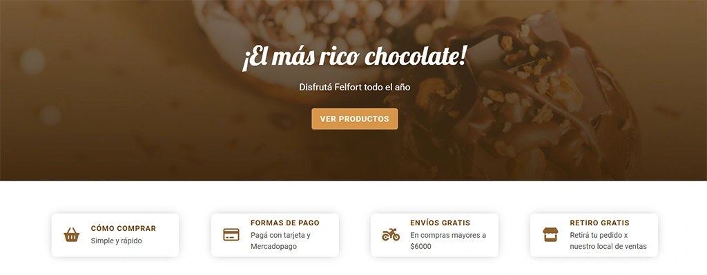
The hero image and CTA’s have been reworked with higher contrast so they’re easier to read by users, screen readers, and search engines.
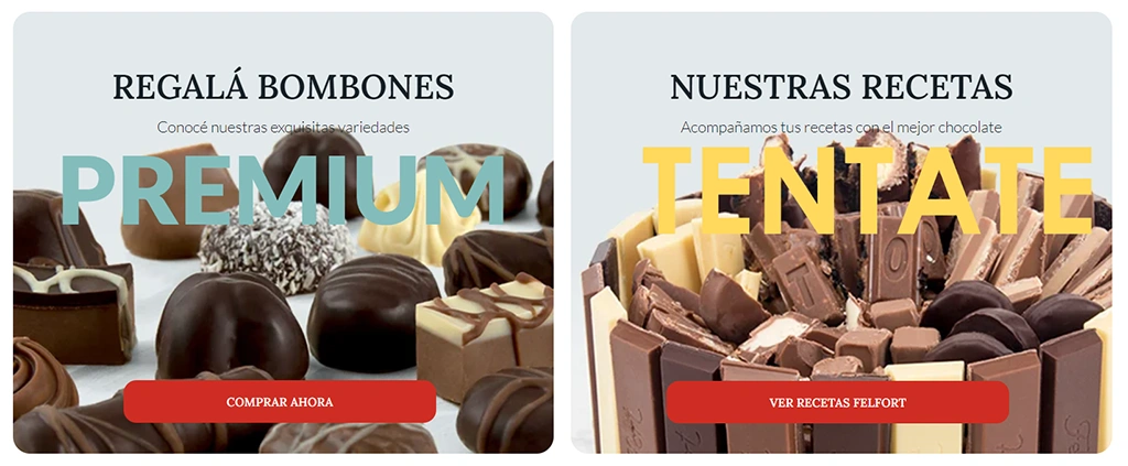


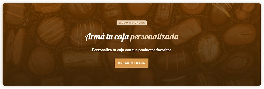
I decided to keep the basic structure of the product carousels on the main page using Owl Carousel to make them responsive.

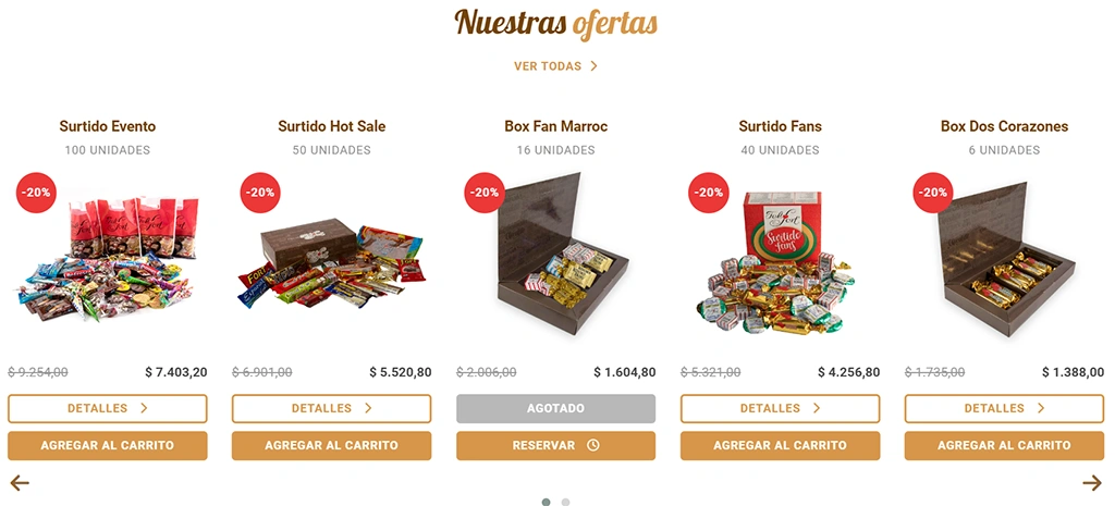
I also added a few other features, such as:
Several navigation links on the menu were redundant, while others were simply out of date (such as the Easter catalogue, which is inactive outside of Easter season). These categories were also repeated on the main page, so instead of simply adding links to them (as seen in the original website), I thought it was best to display a few products from each category.
The landing page was starting to look overcrowded with products from the catalogue, which could seem a little aggressive to users. That was when I thought it could be a good idea to lift the newsletter CTA from the footer and place it between the categories.

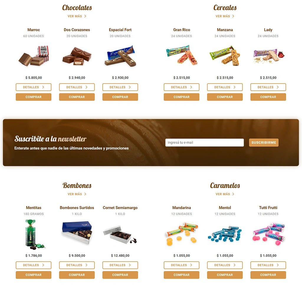
And yet there was another issue: the social media icon links simply didn’t look well, and it seemed like a bit much for a single CTA. Eventually, I thought it was best to move them to the footer instead, right under the contact info.


The main issue with the landing page so far was that it was looking too much like a catalogue. “Buy this,” “These are our products,” and “Here are even more products” seemed to be the main messages. It was just too aggressive, and I thought more helpful contents had to be offered to users, besides the products, whether they choose to make a purchase or not (but also to help them make a favorable decision by showcasing the benefits of the products themselves).
That’s when I found out the brand also had a separate blog website which featured the brand’s history, recipes that could be prepared with their products, and news about chocolate and their brand’s new launches, so I thought it could be a good idea to showcase these contents on the landing page as well.
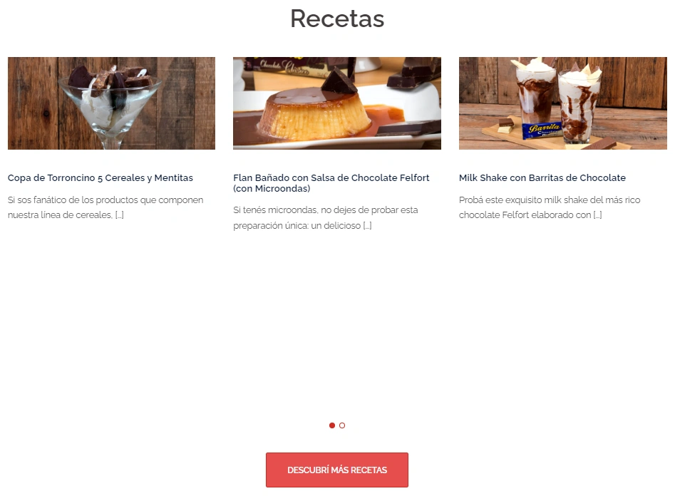

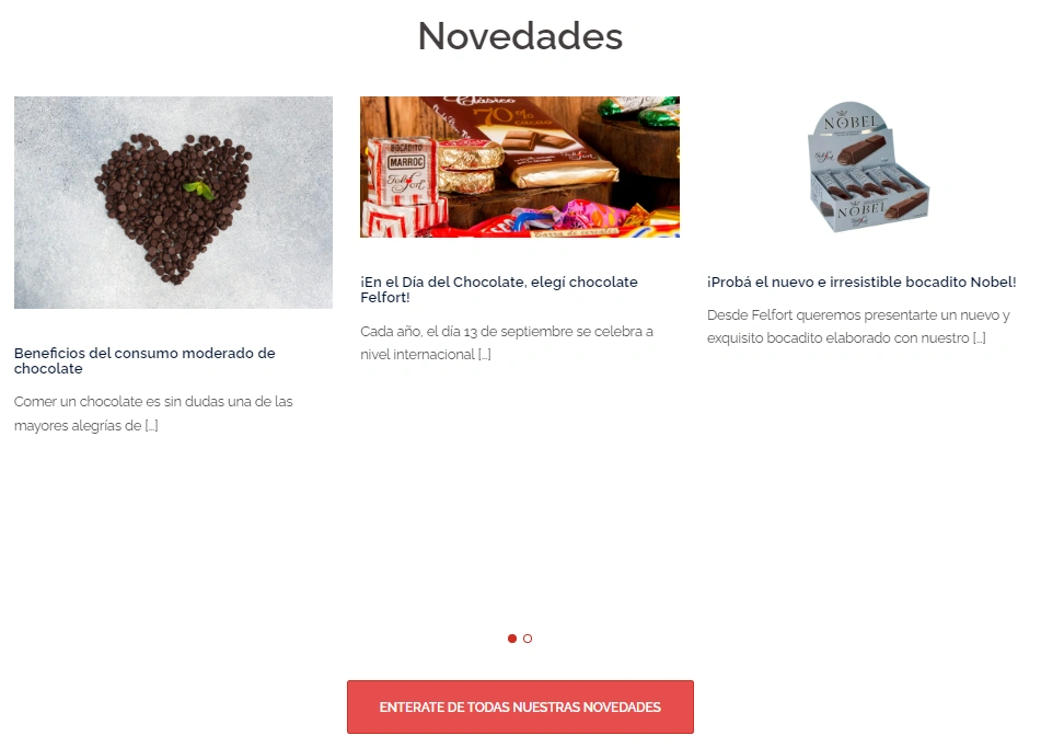


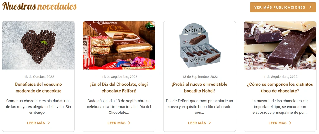
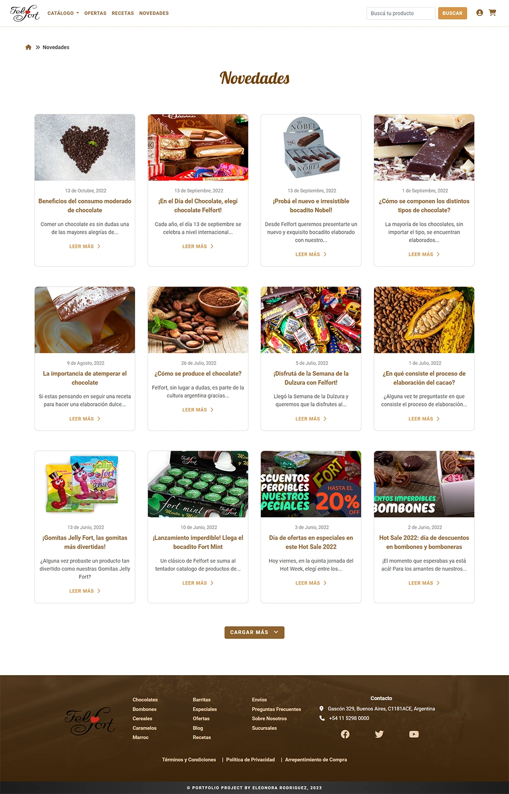
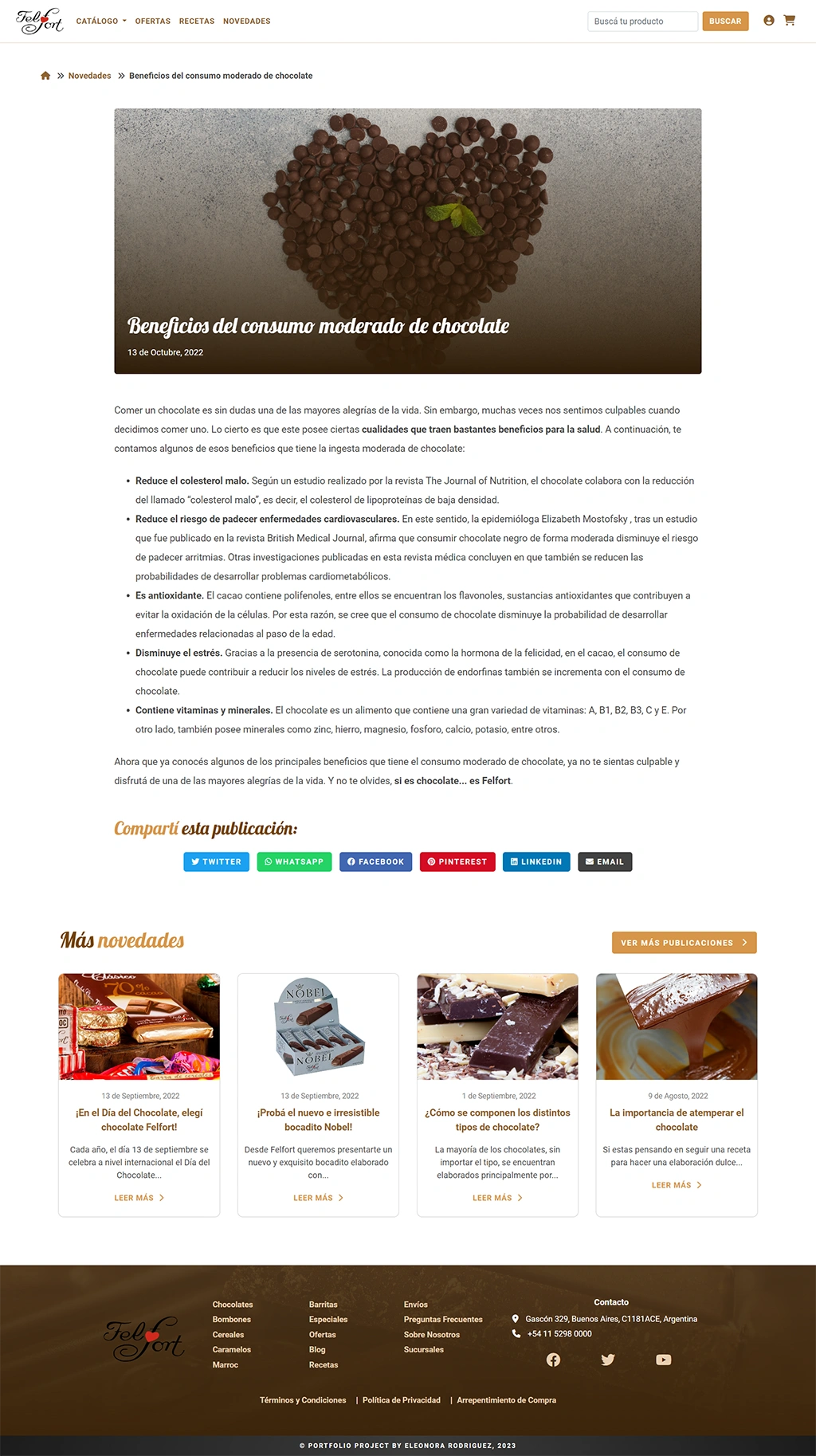
The original News page itself looked rather old-fashioned, while technically responsive. Recipes were also mixed with the news posts. Besides separating Recipes and News on their own categories, I also styled the posts as cards on a grid.
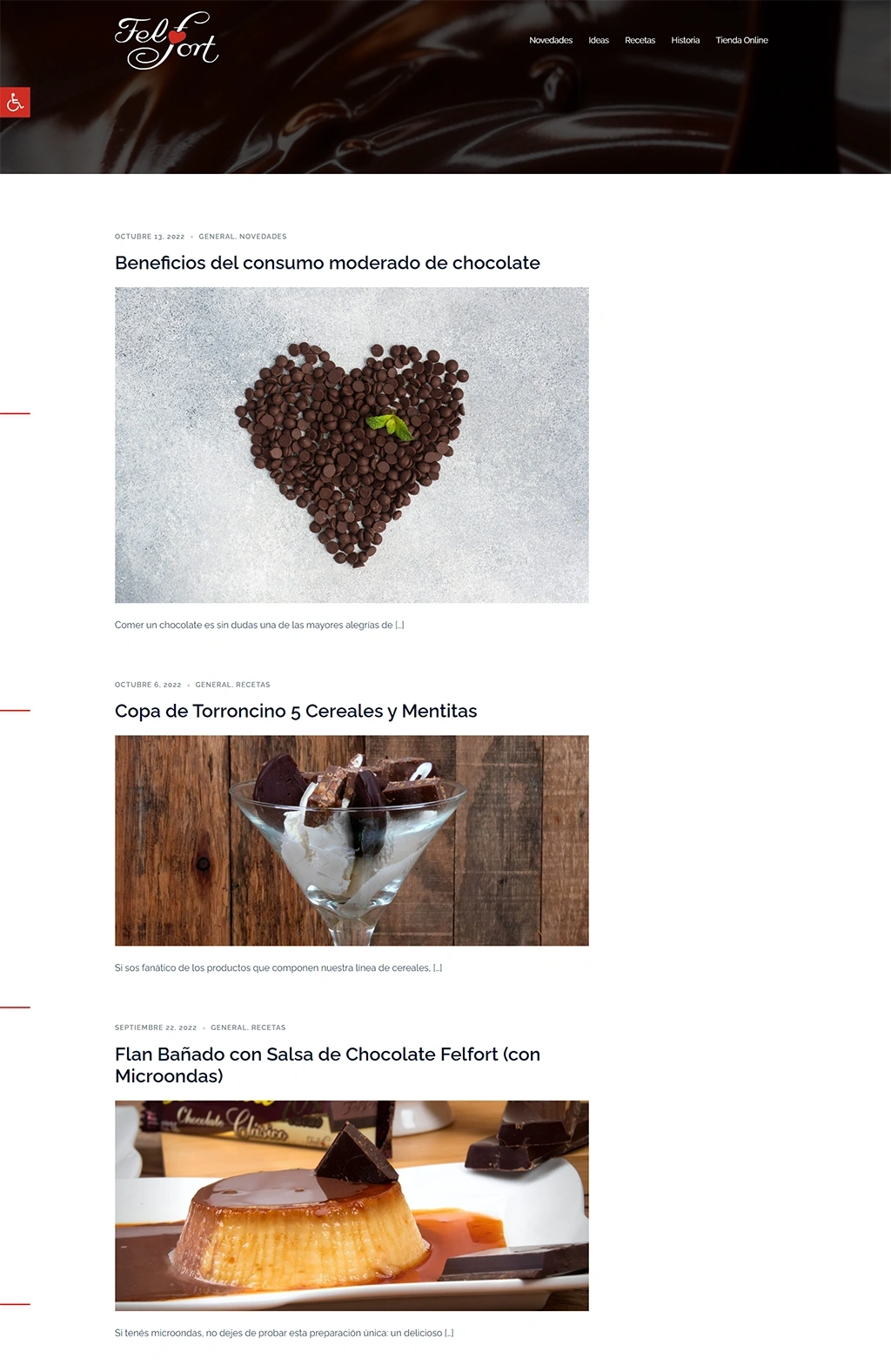
Additionally, this is what my blog post page redesign looks like, in comparison to the original one:
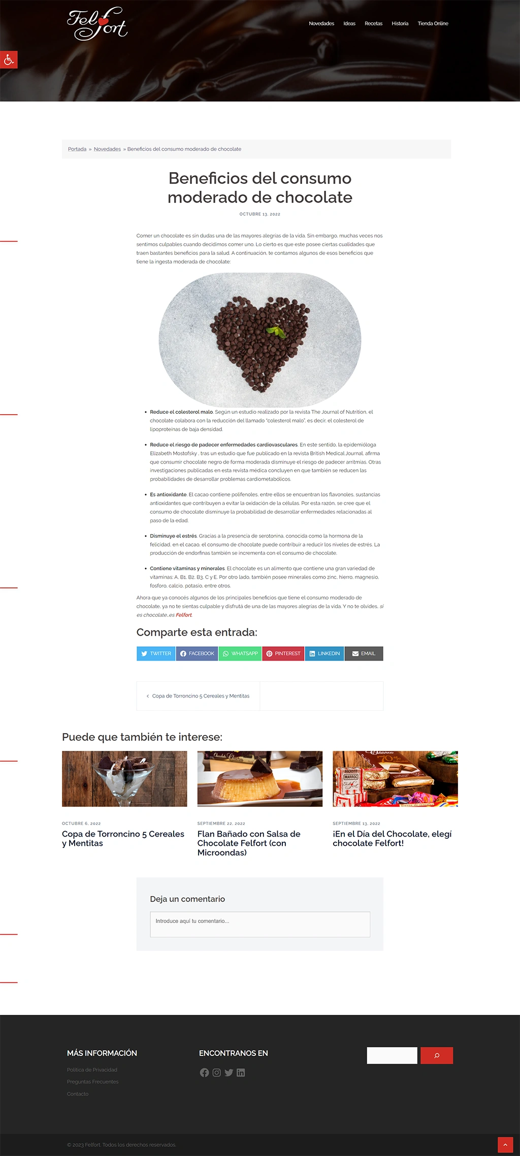
My main purpose with this rework was to: